Portfolio

This semester has been a great photography experience. I feel like if I don’t have a challenge it is hard to take out my camera out for a trip. However, I’ve had the opportunity to do that this semester and it has been exciting to see how much you can do when you practice.

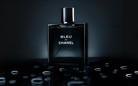
From portraits to product, there are many different types of photography and each has its beauty. I have to admit I never thought product photography was very interesting before I tried it, but I can now say it is one of my favorites. In fact, I will put more effort into learning product photography because I think it can be very useful in the future.

As for principles, there are a lot of things to take into account when snapping a photo, specially when you think of the many different types of photography that exist. However, the more I learn the more I realize how important light is. Light is truly the element that make the picture what it is. Pictures are nothing more than light captured in by the sensors in our cameras. That is why I think it is a challenge to understand light and it’s qualities, but one that will make me a better photographer.

In brief, I am grateful for this last months and the opportunity I’ve had to learn, and I hope I can continue to do so in this next year.

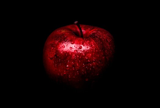
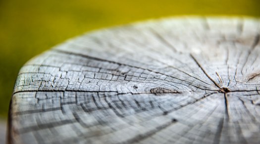
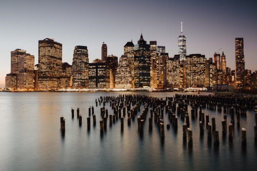
Just in case you have missed my last posts, here are some of my favorite shots from this last few months:

VenuePortraits_DanielOrtega4VenuePortrait_DanielOrtega1VenuePotrait_DanielOrtega5VenuePortrait_DanielOrtega3StyledFood_DanielOrtegaProductStyled_DanielOrtega2FineArtPrintAfter_DanielOrtegaFineArtTetons2_DanielOrtegaFineArtSkyMountain1_DanielOrtegaLong-Exposure-Indoor1_DanielOrtegaDanielOrtegaAppleDanielOrtegaFriendVenuePortrait_DanielOrtega2ProductStyled_DanielOrtegaFinal-Movie-Poster-Letters

Outdoor/Studio Portraits

Portraits are a great way to capture people. I have always loved portraits because they allow you to capture a moment that will never go back. That is why this last week I have been working on taking some portraits in different settings. For this reason, I have completed a series of portraits both outdoors, and in a studio set up to try to deepen my understanding of portraits .

You probably have already guessed, but just like in any other type of photography light is essential. The angle of the light and the intensity can really make or break a portrait as it allows for the tone to be set for the portrait. Using light at a certain angle can produce a moody portrait, while using another angle can give you a soft and flattering portrait. Once you understand how to use the light both outdoors and in a studio you will be able to create amazing portraits.

Here are some examples of my work for the last week. Some of the portraits used continuos light, and some other flash and modifiers to get the desired effect.

OutdoorPortrait1_DanielOrtegaVenuePortrait_DanielOrtega1VenuePortrait_DanielOrtega2VenuePortrait_DanielOrtega3VenuePortraits_DanielOrtega4VenuePotrait_DanielOrtega5


Product Photography

We have all seen pictures of food or product on magazines, websites and others, that make you want to buy them. Well, product photography is a type of photography that is powerful and very useful when used correctly.  That is why this week I was working on improving my skills when photographing objects as if they were to be sold.

Before continuing, I would like to say product photography is much harder than it looks, and teaches you more about light that you would think. Fortunately, I was able to have a seminar about product photography and the ways to light different types of materials from the great photographer Gerardo Sumano. Thanks to his lessons I was able to drastically improve my skills, and I was also able understand how light works when photographing objects.

Once again, light is essential for good product photography. Light helps to shape the object and make it appealing. However, it also important to understand that different materials reflect light differently. Metal doesn’t reflect light the same wood does, or plastic does. That is why it is also important to understand your product so that you can illuminate it correctly.

The same goes for food photography. You can do a lot if you can understand that lighting the product from a certain point will bring out the texture of the ingredients and make the image appealing to the viewer.

Here are some examples of the different images I was able to capture using this principles for both food photography and product photography:

Food Photography

StyledFood_DanielOrtega

StyledFood_DanielOrtega3

StyledFood_DanielOrtega2

Product Photography

ProductStyled_DanielOrtegaProductStyled_DanielOrtega3

For this last image, I decided to recreate a commercial I had seen in a magazine before. This image turn out to be complicated to recreate, but thanks to the help I had from Gerardo I was able to understand from which points to light up the product so that I could get the different lines of light on the bottle and drops. Also, the final image is a composition of more than 8 images taken from the same point and merged to get the final result.

ProductStyled_DanielOrtega2

If you are interested in learning more about this type of photography I would suggest you watch some youtube videos to better understand the concepts I mentioned. Nevertheless, don’t forget to try out new things and to always practice.

Fine Art Print

I have been meaning to print one of my pictures for a while now. However, I didn’t feel like any of them was good for a big print until recently. As I commented on my last post, I had the chance to visit the Grand Teton National Park where I was able to take a lot of good pictures.

Finally, I decided it was a good time to print so I selected one of my favorite images and go to work with it to prepare for pint. When you plan on printing an image, there are several things you need to pay attention to if you want your print to look the way you had in mind.

So here is my picture before I go it ready for printing:

FineArtPrintBefore_DanielOrtega

In my opinion, this image was good enough that the editing was minimum, but in order to prepare for printing the first thing I did was to make sure the image was not too dark. This might not be the case for everyone, but when I have printed I have realized that my images tend to look darker than on a screen, which is the reason why after editing, I prepare for printing by lighting them so that the print is not too dark.

Sharpness would be another think to consider when printing in a large format. You might work with a big screen, but you still want to zoom in in your focus spots and make sure that the image will have enough resolution to look good once printed in a large format

I would also recommend to plan on printing your image more than once. The way a computer screen shows color is not exactly the same way a printer will show the color when printing. Therefore, prepare your image as much as possible, but be patient and understand you might need to print you image more than once if you want it to look just like you had in your computer.

In the case of the image I selected for the print, there was no sharpening to since I made sure to do it as part of my edit. However, I lighted my image a bit to compensate for the print, so here is the after:

FineArtPrintAfter_DanielOrtega

Printing is definitely a challenge, but there is something special about holding one of your images in your hands that makes it all worth it; I would definitely recommend anyone to try it. Finally, if you have the chance to visit the Spori building in Rexburg, Idaho you can check the final print. Otherwise, here is the final print:

FineArtPrintFinal_DanielOrtega.jpg

Fine Art Photography

Fine Art photography is a very interesting type of photography. This type of photography  can take many form as there are many things that can be defined as fine art. In fact, there are many different types of fine art, which is why I decided to try this type of photography this week.

I specially like, macro photography and landscape photography and since I got the chance to on a small trip, I was able to take advantage of the beautiful views to take a couple pictures. Here are the pictures divided by the places where I took them:

Sky Mountain Lodge

I took this pictures at the place I stayed during my trip. It was a nice place so I wasn’t too hard to find several good places to take good pictures at.

FineArtSkyMountain1_DanielOrtegaFineArtSkyMountain2_DanielOrtegaFineArtSkyMountain3_DanielOrtegaFineArtSkyMountain4_DanielOrtega

Grand Teton National Park

I also had the chance to visit part of the Grand Teton National Park, and Jackson Hole. Unfortunately it was pretty cloudy most of the day, which is why I didn’t get the best shots of the mountains, but I still got some pretty good shots. If you ever have the chance, I would highly recommend visiting this National Park.

FineArtTetons1_DanielOrtegaFineArtTetons2_DanielOrtegaFineArtTetons3_DanielOrtega


Long Exposure Photography

This week I decided to work on long exposure photography. This type of photography uses a very long shutter speed (usually over 1 second) and because of that it need very small amounts of lights. Therefore, I experimented by shooting both outdoor and indoor at night or with very low light to get the results I wanted.

Outdoor

For this first outdoor picture I used a tripod so that the picture wouldn’t have any blur, a shutter speed that varied between 10 and 15 seconds, and I used strong flashlights to shine the image.

Long-Exposure-Outdoor2_DanielOrtega

For the second outdoor picture I used a tripod and a 10 second shutter speed, but instead of lighting up the image I draw with the light of a flashlight to get the figures in the image.

Long-Exposure-Outdoor3_DanielOrtega

For this last outdoor image I also used a tripod, and I used steel wool on fire which was hold together with a rope attached to a whisk.

Long-Exposure-Outdoor1_DanielOrtega

Indoor

For this first indoor image, I had a tripod, a 15 second shutter speed, and a flash shooting at a model in three different positions as she moved.

Long-Exposure-Indoor1_DanielOrtega

For this second image, I had a tripod and a 10 second shutter speed while I painted this flowers with a small dimmable flashlight.Long-Exposure-Indoor2_DanielOrtega

For this last image, I also had a tripod and a 10 second shutter speed while I painted with a small dimmable flashlight Long-Exposure-Indoor3_DanielOrtega

Movie Poster

Movie posters can be eye catching. That is why this week I decided to replicate a movie poster from a TV show called MR. ROBOT. This TV Show is based on the life of Elliot, a cybersecurity employe by day and a hacker by night, as he joins a group of hackers with the purpose of taking down one of the biggest corporates in the world.

The reason why I chose this poster is because it uses an interesting composition and I thought that would be a good challenge when creating a replica.

The first step to accomplish the poster was to get an image that had similar lighting and pose. For that a used a self-portrait as you can see in the image below. This was a bit harder than I thought, but I was able to accomplish the desired result by using a background light and a flash close to my face.

Base-Movie-Poster

The second part was to find a picture of the skyline of New York which I found at unsplash.com. If anyone is looking for free images this is one of the best sites to use as it allows you to modify and use the images in anyway you desire without breaking copyright laws.

sweet-ice-cream-photography-732946-unsplash

I finished the edit by painting the skyline so it would match the color of my picture, erasing part of my face, and adding some text to match the original movie poster.

Final-Movie-Poster-Letters

imagehandler

*Tip: You can use something like Fontmeme.com to look up fonts that are similar to the ones used in a movie poster.

SQIBB: Studio Quality Invisible Black Backdrop

This week I decided to work on a project in which I could learn how to manipulate light no matter the place. In order to do this I used the SQIBB technique taught by Glyn Dewis at Photoshop World a couple years ago. In this technique you are able to accomplish studio quality images through the uses of auxiliary lights.

I used this technique for the following images and the results were amazing. Auxiliary light can be a great help when shooting and I think this images show that. In order to use this technique I had the white balance set to flash, the ISO to 100, the shutter speed to 1/200, and the aperture between 8 and 16 since I was indoors.

Fine Art

DanielOrtegaApple

ISO: 100

F-stop: F/16

Shutter speed: 1/200

Focal Length: 70 mm

Portrait

DanielOrtegaFriend

ISO: 100

F-stop: F/9

Shutter speed: 1/200

Focal Length: 105 mm

Portrait

DanielOrtegaMaryn

ISO: 100

F-stop: F/8

Shutter speed: 1/200

Focal Length: 145 mm

Here is my set up

DanielOrtegaSetUp

Contest Submission

As the semester is finishing I decided to submit some of my photography to competitions as I thought would be the best way to learn how I am doing overall.

However, most of the contest I have checked required an entrance fee so I searched for a free website and I came across Pixoto. In this website, images are showcased by two and make the users choose between two images allowing for a ranking that comes out every week. Once the images are picked as part of the best of the week they keep going for the best of next week, the best of the month and best of the year.  This provides for great feedback which is important to learn.

In my experience, this website has been a great for me to showcase some of my work. In fact, out of the images I submitted, four won best of the best of the week and two of them have continued as best of the week for two consecutive weeks. This has allowed me to share my works and success in social media and to get some more attention which is great. I also think it has boosted my motivation to continue to do this as more than a hobby.

Here are the four images that have won the week awards, and the last two winning for two weeks:

Here are the links to the website:

http://www.pixoto.com/danielortega/awards/07-07-2017

http://www.pixoto.com/danielortega/awards/week-27-2017


Submission Date: July 7th 2017


Photobook COMM 300

As I finish this semester if college I am happy to be able to say I learnt a lot and this is the result of the great things I learnt. This phonebook contains the images I have been able to take and edit during the last three months. Some of the images have been modified a bit as the images usually print darker than they appear, but all of them are mine.

In order to design the individual pages to my liking I used Adobe InDesign. This allow for total customization even though I didn’t;t really now how to use the software and it took me a while to get things done. I also did some pre=printing to see some of the layouts and how the book overall would turnout. Overall, the experience was amazing. There is something different about having your work printed that is truly rewarding.

If you want to check out my book here is a digital copy of the final design and layout.


Daniel Ortega’s Photobook